-
About
Our Story
back- Our Mission
- Our Leadershio
- Accessibility
- Careers
- Diversity, Equity, Inclusion
- Learning Science
- Sustainability
Our Solutions
back
-
Community
Community
back- Newsroom
- Webinars on Demand
- Digital Community
- The Institute at Macmillan Learning
- English Community
- Psychology Community
- History Community
- Communication Community
- College Success Community
- Economics Community
- Institutional Solutions Community
- Nutrition Community
- Lab Solutions Community
- STEM Community
- Newsroom
- Macmillan Community
- :
- Newsroom
- :
- Learning Stories Blog
- :
- A Conversation with Richard Campbell about the Int...
A Conversation with Richard Campbell about the Intersection of Stories and Stats
- Subscribe to RSS Feed
- Bookmark
- Subscribe
- Printer Friendly Page
- Report Inappropriate Content
Statistics have been used to inform us, change our minds, and even to shock us. From polls telling us who is winning various political races, to commercials telling us about a toothbrush recommended by nine out of ten dentists, to the rise of ocean temperatures over time, facts and figures inform the stories that help us understand the world around us. We spoke to communications instructor and Media and Culture: Mass Communication in a Digital Age author Richard Campbell about how he teaches his students about the stats behind the stories (and the stories behind the stats) and the storytelling at the intersection of journalism and statistics.
Marisa Bluestone: A bit of a chicken and egg question, but what do you think comes first -- the stats or the stories?
Richard Campbell: You can’t have the story without the data, without the stats. The jobs of the news narrative is to transform hard data into something an audience can understand. Bill Kovach and Tom Rosenstiel wrote in their seminal book The Elements of Journalism that the job of the journalist is “to make the significant interesting.”
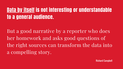
Data by itself is not interesting or understandable to a general audience. But a good narrative by a reporter who does her homework and asks good questions of the right sources can transform the data into a compelling story. Too much mediocre news, however, takes “interesting” stuff -- like a celebrity scandal or an outrageous tweet – and makes it seem significant just by the act of reporting it as news.
Marisa: This could be an entire course, but what quick tips do you have for students to help them translate statistics into stories, or visa versa?
Richard: Funny you should ask this. The Stat+Stories podcast grew out of a course. At Miami, John Bailer -- chair of the statistics department -- and I had worked together to get a quantitative literacy requirement into our college’s curriculum. As part of that initiative, we team taught an honors class called “News and Numbers” in 2009 and developed the podcast in 2013.

My job was to improve their narratives. So one tip is to start a data-based report, not with data and numbers, but with a story that illustrates the impact of the data. For example, do not begin a news story on homelessness with data and percentages. Start the report by telling about a family impacted by homelessness and then lead your audience to the big picture and what the data tell us about the significance of the problem. But first you need to make an emotional connection to your audience. A story does that. It is hard to make such a connection early in a news story by using big numbers.
Marisa: How have recent advancements in data visualization changed the way you teach communications courses?
Richard: At Miami, the statistics department also started a course, in collaboration with the graphics design department and the journalism program, on data visualization. Although I am retired now, I would encourage anyone teaching design or statistics to think about how graphic and data illustrations might be accompanied by a good narrative that help people understand the visuals. A lot of folks are used to making sense of the world through written or video narratives not through a dazzling graphic chart or complex statistical tables. But in combination, we might have a better chance of reaching more of the general audience.
Marisa: It's election season. What role will stats play in how the presidential election is covered? What role should they play?
Richard: I assume you mean stats on political polling and not all the other statistics that are truly important --- like data on income disparities, or unemployment related to the Covid-19 crisis, or the higher percentages of Black and brown people mistreated or killed because of systemic racism. Unfortunately, during a national election, most mainstream TV news outlets obsess over polls – who’s ahead and who’s behind. This is not my area of expertise, but I can report on what experts have told us on our podcast.
Back in 2016, the national polls were within the margin of error. Clinton won by two percentage points – or 3 million votes. But some of the state reporting was flawed, since many formerly “unlikely voters” voted, and Trump eked out an electoral victory by narrowly winning Michigan, Wisconsin, and Pennsylvania.
For 2020, statisticians and pollsters again warn of uncertainty. Determining “likely voters” in the age of Covid-19 and mail-in voting may be a crap shoot. Additionally, increases in robo calls in swing states have made many people more wary of answering their phones. Other than suggesting trends over time, we just don’t really know with any certainty how accurate polls are.
Marisa: Do you think there's room for opinions in data storytelling, or should it all be fact based?
Richard: Good journalism throughout much of the 20th century traditionally tried to separate opinion and analysis from basic news stories, in which reporters learned to keep their opinion out of news reports and attempted to interview multiple sources. Even today most newspapers relegate opinion essays to the editorial and op-ed pages. If a newspaper runs an analysis piece on the front page, it is usually labeled as such.
Cable TV news began blurring these distinctions, especially with the arrival of Fox News in the mid-1990s. Still, even on Fox News, there is generally fairer and more complete reporting in the midday hours before the wave of opinion talking heads ascend in the evening. But this is also true of MSNBC, with its nightly line-up of liberal and progressive talking heads. Still, the best opinion pieces are informed by good reporting and not just cable hosts spouting whatever comes to mind as they try to fill their allotted hour of time.
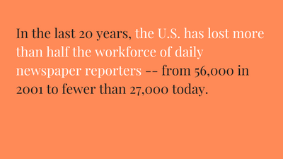
The tragedy, of course, is that many viewers think what they are getting in the evening is fair and balanced reporting. In fact, cable TV news in the evening -- and nationally syndicate conservative and libertarian talk radio throughout the day -- have filled the void created by the loss of many local newspapers. In the last 20 years, the U.S. has lost more than half the workforce of daily newspaper reporters -- from 56,000 in 2001 to fewer than 27,000 today.
A landmark 2017 University of North Carolina study identified 1,300 U.S. communities as “news deserts” – with no local print or digital reporting. In 2020, that figure has jumped to 1,800. About 2,100 daily and weekly papers have stopped publishing since 2004. According to a 2019 Brookings Institution study, millions of Americans see only national stories, and many of those “have a strong partisan bent” or “focus heavily on partisan conflict.” More alarming still, Brookings found the decline in local reporting has been accompanied by “a diminished capacity to hold elected officials and other local leaders accountable and a general disengagement from local politics.” Evidence that we have gathered in Ohio suggests too that letters and comments to editors at small-town papers are now less likely than in the past to focus on local issues. Instead, many merely parrot cable TV talking points.
Marisa: Is there anything I didn't ask you about, but should have?
Richard: I would like to recommend that every journalism student take statistics or quantitative literacy courses and that every math and stats major take journalism courses (plus, all our high schools should be requiring quantitative literacy classes). The ability for mathematician or scientists to translate the complexities of their work into a story for a general audience is key to challenging the anti-science and anti-evidence strains running through our mediated culture.
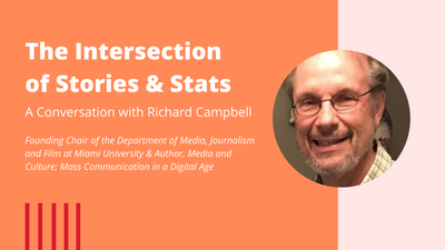
Richard Campbell is professor emeritus and founding chair of the Department of Media, Journalism and Film at Miami University and has been teaching for 48 years. For Bedford/St.Martin’s Press, he is the lead author of three textbooks, including Media and Culture: Mass Communication in a Digital Age, now in its 12th edition. He is also the author of 60 Minutes and the News: A Mythology for Middle America and co-author of Cracked Coverage: Television News, the Anti-Cocaine Crusade and the Reagan Legacy. He also was a print reporter and broadcast news writer in Milwaukee and was high school English teacher and girls’ basketball coach in the Milwaukee Public School system.


