-
About
Our Story
back- Our Mission
- Our Leadershio
- Accessibility
- Careers
- Diversity, Equity, Inclusion
- Learning Science
- Sustainability
Our Solutions
back
-
Community
Community
back- Newsroom
- Discussions
- Webinars on Demand
- Digital Community
- The Institute at Macmillan Learning
- English Community
- Psychology Community
- History Community
- Communication Community
- College Success Community
- Economics Community
- Institutional Solutions Community
- Nutrition Community
- Lab Solutions Community
- STEM Community
- Newsroom
Asking Students to Visualize Their Progress
- Subscribe to RSS Feed
- Mark as New
- Mark as Read
- Bookmark
- Subscribe
- Printer Friendly Page
- Report Inappropriate Content
Since I am currently teaching technical writing, progress reports are on my regular list of assignments this term, but I also use them in both my first-year composition (FYC) and my digital media classes. The assignment works well in the middle of a longer project, be it something like a research project in FYC or a documentary video project in a digital media class.
At its most basic, the progress report is a simple genre with an organizational structure that makes sense to students. I ask students to focus on three sections:
- Section 1: Tell me what you have done
- Section 2: Tell me what you still need to do
- Section 3: Tell me how you will get the remaining work done and let me know about any of your concerns
Students can often accomplish the task in a quick one-page document. The activity works well as an in-class writing exercise, since it requires no research and has a set structure with clear requirements. When students work on progress reports outside of class, I can step up the expectations. For instance, I frequently ask students to include a calendar or a table that shows their remaining milestones or to add specific information that shows their progress.
One of my favorite additions focuses on using visual elements in their progress reports to demonstrate something about the work they have completed or the work they plan to complete. To explain the expectations for this visual addition to the assignment, I post the following description and example on the course website:
Visualize Your Progress
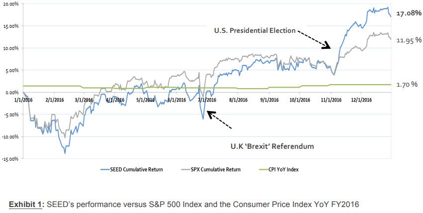
You can often show trends and comparisons with graphical elements better than with text descriptions. Consider the difference between describing the performance of a stock or a portfolio during the last year and showing that performance with a line graph. Here’s an example from the Student-managed Endowment for Educational Development (SEED) 2016 Annual Report [an investment portfolio managed by a student at Virginia Tech]. Which seems easier to read and process to you?
Text Description
The portfolio performed relatively in line or slightly below the respective benchmark until the final quarter, as shown in Exhibit 1. We included the Consumer Price Index as a preservation of spending power benchmark to monitor changes in our real returns. From mid-November to year-end, the portfolio significantly outperformed and finished 2016 with an active return of 5.13%. In order to calculate our risk-adjusted return, we incorporated our portfolio’s beta of 1.2 and historical average for yields on the 1-Year Treasury note (1.84%) in order to compute a CAPM-based implied alpha. This calculation resulted in an implied 2016 alpha of 3.11%.
Line Chart
For my money (pun intended), the line chart is much easier to understand quickly. In many circumstances, you will include both a text description and a graphical representation, which helps ensure accessibility for all readers. The point of today’s post is that the graphical version is not just an illustration. It is critical to showing the reader information about the topic.
Think about how you can add graphical representation of information in your progress report. The infographic How to Think Visually Using Visual Analogies from Anna Vital to see a collection of charts and graphs you can use to communicate information. Once you explore the options, add a pertinent visualization to your progress report.
After this reviewing this information, students have improved their progress reports by adding visual elements like pie charts and timelines as well as photos and screenshots that show their work. It’s definitely one of my favorite class activities because it takes students from reflective text descriptions to considerations of visual rhetoric in just one class session. Have you tried an activity that teaches students to make and use visual elements in their writing? Please share your ideas in the comments below. I’d love to hear about what works for you.
Image credit: Graph from the Student-managed Endowment for Educational Development (SEED) 2016 Annual Report.


