Converting to a More Visual Syllabus

traci_gardner
Author
Author
8 10 10.4K

53506_pastedImage_31.pngHow many times have you said or written “It’s on the syllabus”? I’m tempted to dismiss those exchanges with a frustrated laugh. Those darned kids, right? But I’m a writer, so I can’t just ignore that implicit feedback from my readers. When students ask these questions, they are either letting me know that

  1. they didn’t read the syllabus.
  2. they can’t find information on the syllabus.

Those are both rhetorical problems. I’m not communicating with my audience. I never hear them say it, but I am pretty sure that when they see the wall of text that is my course website, they think, “tl;dr.” That’s “too long; didn’t read,” for those of you not up on textspeak.

In response, I am rethinking the site and adding more visual cues. I already had lots of headings, bulleted lists, and the like. That’s not enough. Students are still stumbling around, unable to find the information. I decided to try more of an infographic-style, with charts, framed pull-outs, and related images.

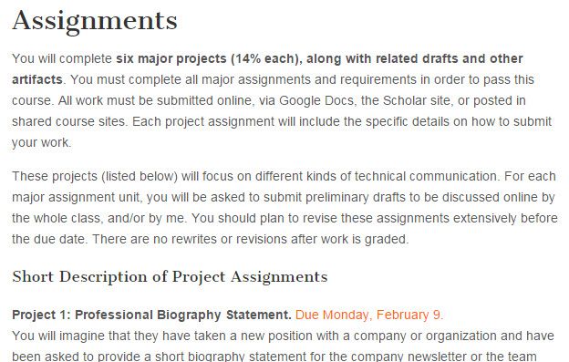
Here’s a before-and-after version of the page I have put the most time into so far. This is the design for the Assignments overview page from Spring semester:

53499_pastedImage_0.jpg

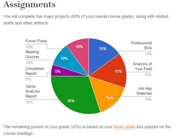
This is the new design for the Assignments overview page for my Summer II section:

53501_pastedImage_2.jpg

Kind of a big difference, huh? I am still struggling a bit with the design and layout. I am working with HTML and CSS to make the layout, so what might be a simple layout arrangement in Word or InDesign is a bit more challenging to pull off in a WordPress post. Beyond that, there’s the time requirement. I have spent at least a day reworking that page, tweaking things and trying different options. I think it’s worth it, but I am not sure I will have time to revise the entire site before classes start on July 7. I’m working on it though, and I’ll keep you posted on student response.

I would love to hear some feedback from you as well. Do you have suggestions for improving the site? What strategies do you try for making you syllabus and course information more reader-friendly? Share some ideas by leaving me a comment or dropping by my page on Facebook or Google+.

10 Comments
karita_dossanto
Macmillan Employee
Macmillan Employee

Fantastic post, Traci Gardner​!  The infographic looks great to me; I can't wait to find out how your students respond.

traci_gardner
Author
Author

No word so far, but it's only the beginning of the second day.

daneryl23
Migrated Account

Nicely explained, Traci, with a good example.  Great idea!   In case you're interested, here is one of my all-time favorite sites by history prof Tona Hangen with more ideas and examples:  Writing Syllabi Worth Reading | Tona Hangen

traci_gardner
Author
Author

Thanks for sharing the link to Tona's syllabus. I remember seeing the US

History syllabus with Dorothea Lange when I was doing some research on

infographic syllabi. I agree. It's a great revision. I'm still working on

upgrading my resources. I keep telling myself to take baby steps. My

biggest concern is making sure it's accessible to all students. I need to

learn a good bit more about how screen readers handle such things, for

instance. Thanks again for sharing!

Traci Gardner

www.tengrrl.com

@tengrrl and @newsfromtengrrl

::::::::::::::::::::::::

Bits Blog: http://blogs.bedfordstmartins.com/bits

ReadWriteThink Author: http://bit.ly/tengrrlatrwt

Instructor at Va Tech: http://www.tracigardner.com

On Mon, Jul 20, 2015 at 8:34 PM, daneryl23 <community.support@macmillan.com>

rblechman
Migrated Account

Here's the visual syllabus I use for my Social Media course at Fordham. A Model Media Ecologist: Social Media Syllabus

daneryl23
Migrated Account

Baby steps is the way to go!  I am starting a new position, and we have a template everyone follows, so I'm somewhat limited at the moment.  But a girl can dream, and I bet something like the cool infographic you created would fit right in now . . . I too hope to figure out the intricacies of design, little by little, as I go.

daneryl23
Migrated Account

This is simply awesome.  Already shared with a colleague!

traci_gardner
Author
Author

Love your syllabus, Robert! I hope to move closer to this kind of complete syllabus soon. Thank you so much for sharing.

Traci

rblechman
Migrated Account

Here is the visual syllabus I use to teach an Intro to Communication and Media Studies class at Fordham. A Model Media Ecologist: Intro to Communication and Media Studies Syllabus

rblechman
Migrated Account

Thanks! I'm looking into incorporating the Digital Identity Mapping grid into my course.

About the Author
Robert K. Blechman graduated from the University of Chicago with a BA in English Literature and earned an MBA in Finance and a Ph.D. in Media Ecology (Media and Communications) from New York University. Dr. Blechman has worked in senior management positions at a variety of iconic institutions including Columbia University Medical Center, PricewaterhouseCoopers LLP, HarperCollins Publishers, Olympia & York Real Estate Management and CBS News. Starting on May 6, 2009, Dr. Blechman began a Twitter literary experiment: Was it possible to maintain a narrative structure and attract a reading public in Twitter, 140 characters at a time? Posting a new story “tweet” twice a day, every day, never missing a deadline, he completed his “twitstery” or Twitter mystery in 15 months. In 2011 NeoPoiesis Press published the collected tweets in book form under the title "Executive Severance" which won the 2012 Mary Shelley Award for Outstanding Fiction.